DataQ Health - Transforming Healthcare, One Solution At A Time.

At DataQ Health, we harness cutting-edge technology to revolutionize patient care by providing advanced tools to make informed decisions in a value-based care landscape.

We leverage our clinical, technological, and analytical expertise to develop solutions that simplify and enhance healthcare delivery for providers and organizations.

Our combined proficiency in clinical practice improvement and technological advancement places us at a unique vantage point. Using data-driven choices healthcare service organizations can make better decisions.

Role

UIUX Designer

Timeline

09 months (Jan – Sep ’23)

Core Responsibilities

UIUX design, product strategy, research, interaction design, A/B testing and product roadmap.

Problem & Insights

The Challenge in Digital Healthcare

In digital healthcare landscape, patients and clinicians often struggle with fragmented health data, unintuitive user interfaces, and poor communication tools. Before the development of Dataq Health, many users relied on outdated systems that were difficult to navigate, visually inconsistent, and not optimized for modern web experiences.

Goals

From Frustration to Clarity: Dataq Health’s Mission to Humanize Healthcare Through Design

We had to take a fresh look at what the Dataq Health app could do to make sure it truly helped both patients and doctors. The old version was confusing and missing key features, so I helped shift our team’s focus toward a clearer, more user-friendly plan. Using ongoing feedback from real users, I created a four-step plan to fix the most important issues—like making health records easier to understand, simplifying how appointments are booked, improving how patients and doctors communicate, and adding helpful tools to track health over time. Taking it one step at a time, we turned Dataq Health into a much easier and more supportive app for everyone who uses it.

Instead of diving into a full-scale redesign right away, we took a more focused approach with Dataq Health. We started by building just the features our users—patients and clinicians—needed most. This helped us make sure we were solving the right problems from the beginning. Once we saw those core features working well and getting good feedback, we felt confident adding more advanced tools step by step.

Solution

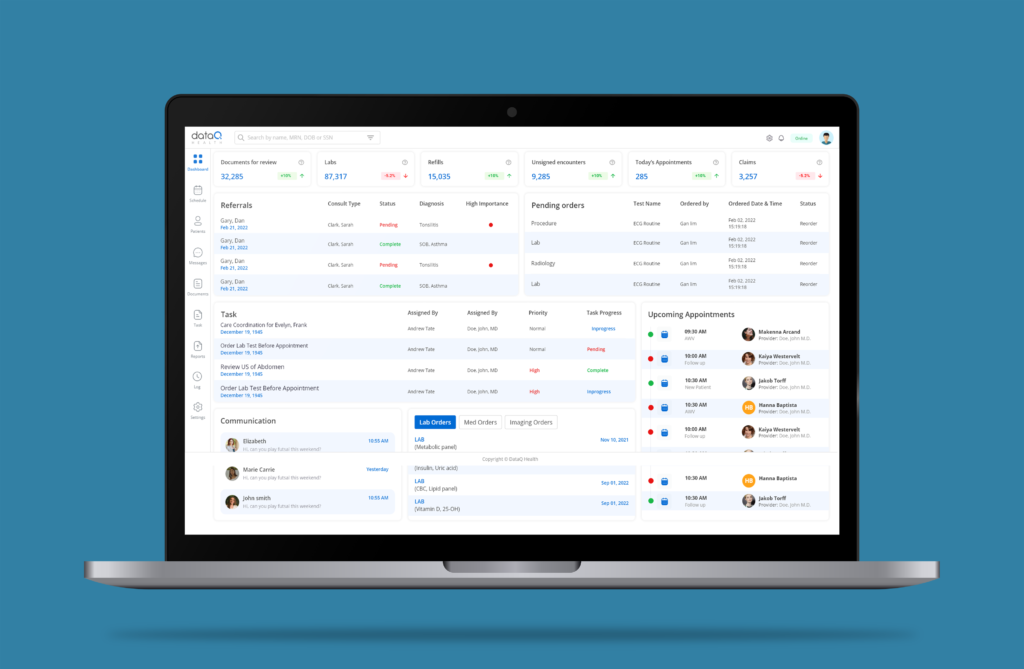
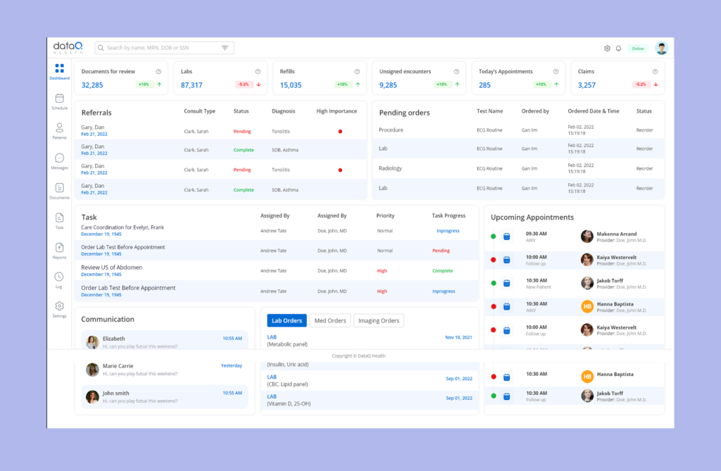
The dashboard redesign, turning it into an intuitive command center that meets user needs. This empowered patients and clinicians to access and manage health data quickly and confidently.

Through close collaboration with our product manager, developers, QA testers, data analysts, and customer support team, we transformed the Dataq Health web app from a fragmented and overwhelming platform into a user-centric experience. This redesign led to improved clarity, stronger engagement from both patients and clinicians, and a more accessible, trustworthy healthcare tool.

Working on this project reinforced my belief in the importance of a user-centered design approach. Prioritizing real user needs over trendy design patterns helped me develop a deeper understanding of our diverse user base, including patients of varying health literacy levels and clinicians managing high workloads. I’ve learned that meaningful design comes from empathy, evidence, and iteration—not aesthetics alone. Staying grounded in research and user feedback ensured that our solutions not only looked modern but genuinely solved problems for the people who rely on them every day.


Designing a Unified Homepage for Dataq Health

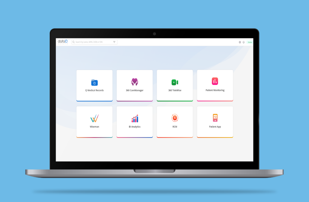
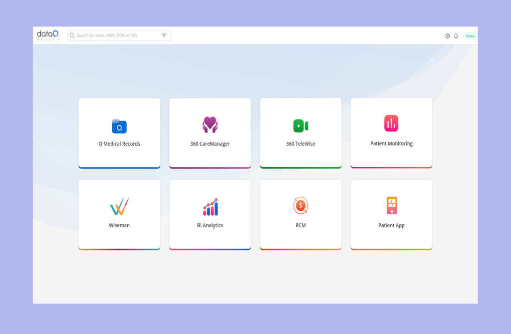
One of my key contributions to the Dataq Health web app was designing a streamlined, user-friendly homepage that brought together multiple critical modules into a single, cohesive view.

To reduce cognitive load and improve accessibility, I consolidated high-traffic features—including Q Medical Records, CaraManager, Patient Monitoring, and RCM (Revenue Cycle Management)—into one unified dashboard. This allowed users (especially clinicians) to quickly access essential tools and information without jumping between multiple tabs or pages.

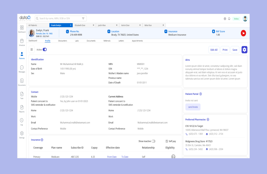
👤 Patient Profile & Dashboard Screen – Designed for Clarity and Control

In the Dataq Health web app, I designed the Patient Profile Screen to let users view and edit their contact details easily. It also displays nearby pharmacies, health alerts, and recent lab results in one place. This streamlined layout boosts clarity, transparency, and patient engagement.

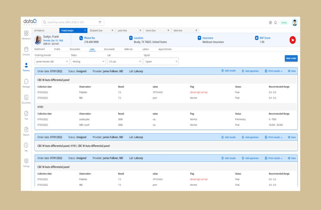
🧪 Lab Results & Appointment Schedule Screens

I designed the Lab Results and Appointment Schedule screens for Dataq Health to provide patients with easy, transparent access to their health data and upcoming healthcare engagements.

The Lab Results screen allows users to view detailed and easy-to-understand reports of their recent tests, with clear visualizations and explanations to help them track their health status over time.

The Appointment Schedule screen offers a straightforward calendar view of upcoming and past appointments, with options to book, reschedule, or cancel visits as needed. Notifications and reminders are integrated to ensure patients never miss important consultations.

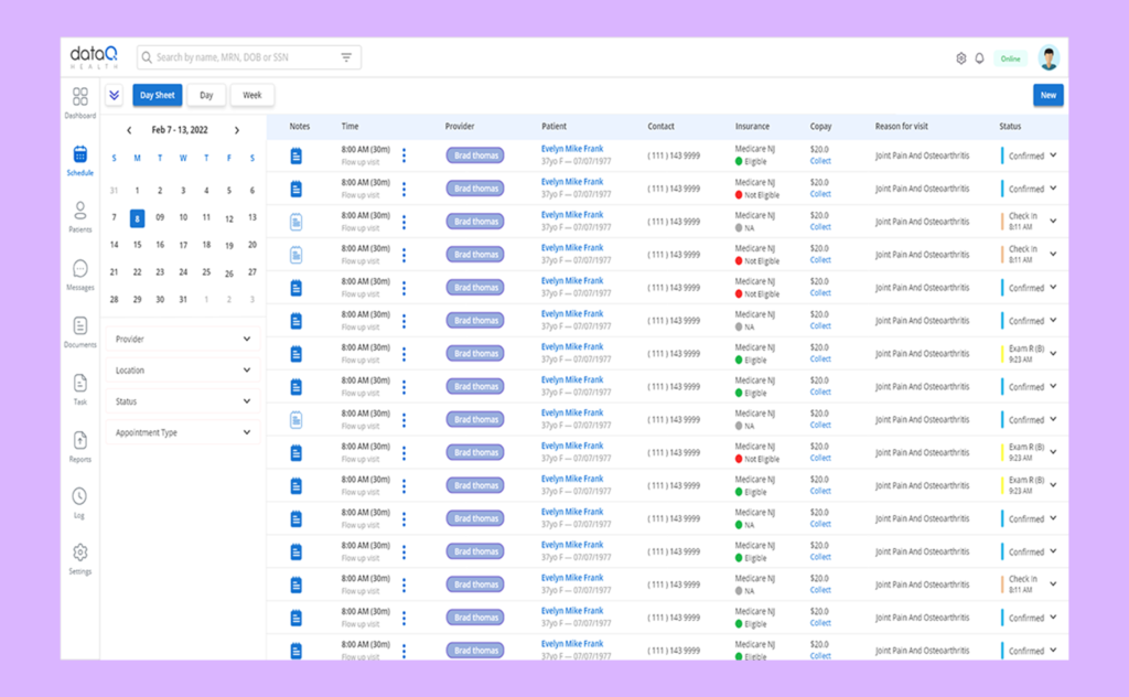
📅 Schedule Screen Design

I designed the Schedule Screen for Dataq Health to give healthcare providers a flexible and comprehensive view of patient details and appointments. The screen displays all relevant patient information alongside their schedules, with easy toggles to view appointments by day, week, or month. This layout helps providers efficiently manage their time and patient flow, ensuring they have all necessary details at a glance for better care coordination.

📅 Appointment Screen Design

I designed the Appointment Screen for Dataq Health to provide healthcare providers with a consolidated view of each patient’s details alongside their scheduled appointments. This screen allows providers to quickly access important patient information—such as contact info, medical history, and previous visits—while managing upcoming appointments. The integrated layout streamlines workflows by combining patient data and appointment management in one place, enabling more efficient and informed care delivery.

Results

Culminated in an impressive 100% surge in user retention and a substantial 60% increase in new user registrations, further solidifying Dataq Health’s position as a trusted platform in the digital healthcare space.

User feedback vividly illustrates the transformative impact of Dataq Health’s enhancements. Many users praise the revamped experience for its seamless and intuitive navigation, while others highlight the platform’s improved clarity, transparency, and streamlined access to critical health information. A recurring sentiment among patients and clinicians alike is the increased confidence and control they now feel—enabling them to better understand health data, track progress, and make informed decisions for their well-being.

Strategic phase 1 of 4

Conducted user interviews to gain deep insights into the pain points and usability challenges faced by patients and clinicians, using their feedback to guide targeted improvements and optimize the web app experience.

As a UI/UX Designer, I collaborated closely with the Product Manager and engineering team to identify and understand the key pain points causing frustration among our users—both patients and clinicians. Through user interviews, data analysis, and feedback sessions, we uncovered the obstacles that were hindering their experience and engagement with the platform. Together, we brainstormed and designed targeted solutions aimed at improving usability, increasing satisfaction, and ultimately fostering greater trust and retention within the user community.

Online Interviews

The flexibility of online interviews enabled us to reach users from various demographics and locations, ensuring our research was inclusive and representative. Through open-ended questions and task-based walkthroughs, we identified key pain points and usability issues, which directly informed our design decisions and prioritization of new features.

Strategic phase 2 of 4

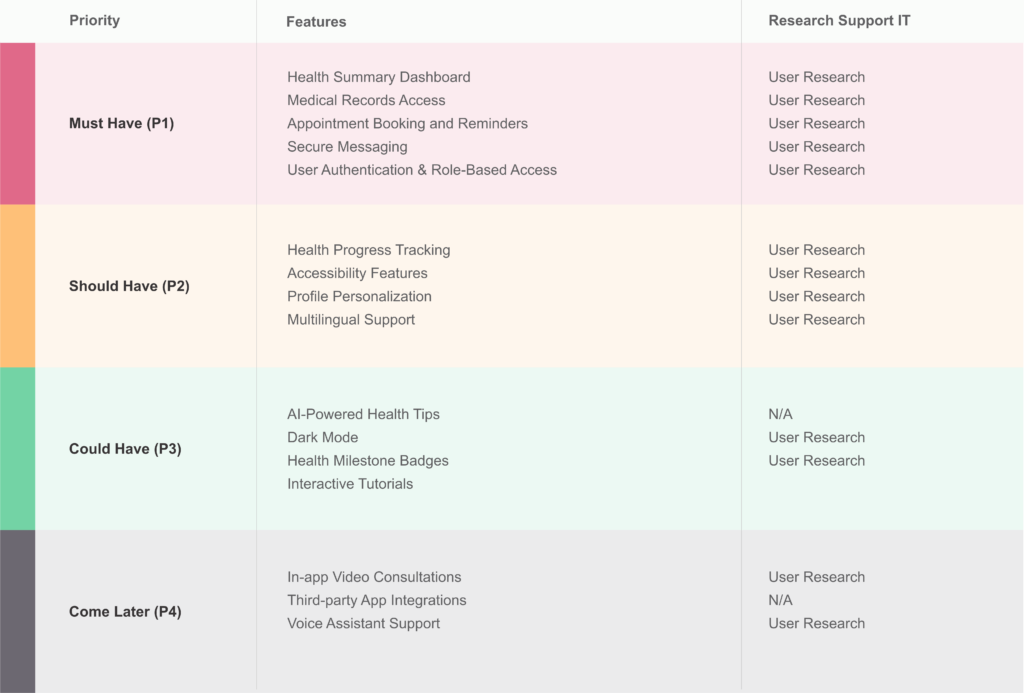
I facilitated several brainstorming sessions with the team to generate a comprehensive list of potential features aimed at improving the Dataq Health web app. To prioritize these ideas effectively, I created a detailed product roadmap using the MoSCoW method. Features were categorized into four priority levels: Must Have (P1), Nice to Have (P2), Surprising and Delightful (P2), and Can Come Later (P4).

This structured approach helped us focus on delivering critical functionalities first while keeping room for enhancements that would elevate the user experience.

Balancing the presentation of complex health statistics for a diverse user base—including patients of varying ages and health literacy levels—while carefully addressing accessibility needs and minimizing cognitive load.

During a collaborative session focused on our top-priority features, the Product Manager proposed incorporating graphical representations of health data to better illustrate patients’ progress. While the team was excited about this idea, I raised concerns regarding its accessibility and effectiveness for our diverse user base—particularly since a significant portion of our patients are middle-aged, with varying levels of digital literacy and comfort interpreting complex visuals. We discussed how to balance engaging data visualization with clarity and usability to ensure the feature would truly benefit all users.

My primary concerns revolved around accessibility and cognitive load. I stressed that, based on our user base’s diversity, a text-based approach in the user interface typically offers better compatibility. Additionally, I highlighted that infographics can be visually demanding, possibly requiring users to process multiple elements simultaneously. This could lead to increased cognitive load, particularly for users with cognitive impairments or those unaccustomed to interpreting infographics.

Despite the initial enthusiasm for the infographic approach, I remained dedicated to prioritizing user-centric design principles. Following extensive deliberation and productive discussions with the team, I effectively conveyed the significance of adopting a balanced approach. Consequently, we arrived at a consensus to create two versions of the feature and proceed with an A/B testing strategy. This strategic decision will enable us to collect invaluable user feedback and data, ensuring that the feature caters to the preferences and comprehension levels of all our users, regardless of their age or background.

Transitioning from an unclear and fragmented feature set to a precise, comprehensive, and user-centered platform that effectively addresses the needs of patients and clinicians.

Introducing new features

Redesigned Dashboard: A centralized hub providing patients and clinicians with quick access to critical health information, upcoming appointments, and personalized insights—all presented clearly and intuitively.

Improved Health Records Access: Streamlined navigation to medical history, lab results, and prescriptions, making it easier to find and understand important data.

Secure Messaging System: Enhanced communication tools allowing patients and healthcare providers to exchange messages quickly and securely, improving care coordination.

Appointment Management: Simplified scheduling and reminders to reduce missed appointments and improve patient adherence to care plans.

Accessibility Enhancements: Features like keyboard navigation, screen reader compatibility, and adjustable font sizes to ensure inclusivity for all users.

Interactive Data Visualizations: Clear graphs and charts that help users track health trends and progress over time without overwhelming them.

Strategic phase 3 of 4

Validation

User preferences in A/B testing showed a clear favor for infographic-free features, reinforcing our commitment to simplicity, accessibility, and overall user satisfaction in the Dataq Health web app.

Throughout our A/B testing process, we conducted multiple rounds comparing two versions of key features—one with detailed infographics and the other with a simplified, infographic-free design. Notably, a significant portion of our users, including middle-aged patients and clinicians, consistently preferred the version without infographics, finding it clearer and easier to navigate. This insight was especially important given the diversity of our user base and varying levels of health literacy.

Additionally, users expressed strong satisfaction with the new features we introduced, such as clearer health data summaries, streamlined navigation, appointment insights, progress tracking, and personalized health forecasts. They also appreciated intuitive placements of key actions—like quick access to messaging and appointment scheduling—making the platform more convenient to use. The improved visual contrast on critical screens further enhanced readability, underscoring our commitment to designing with accessibility and user feedback at the forefront.

Strategic phase 4 of 4

Beta Launch: Enhancing User Experience

During the beta launch of the Dataq Health web app, we leveraged valuable insights gathered from the soft launch to further refine the user experience. Our primary objective was to collect crucial feedback from both patients and clinicians on the revamped platform.

Users overwhelmingly praised new features such as the Health Summary Dashboard, Progress Tracking, and Appointment Reminders. These additions improved transparency and empowered users to take a more active role in managing their health.

However, it became clear that some users found the separate tabs for medical records and communication unnecessarily complex. In response, I led a redesign that removed these tabs and introduced a prominent messaging button directly below the health overview section. This streamlined navigation, making it easier for users to access essential functions, and reflected our commitment to prioritizing user feedback and continuously improving the platform’s usability.

Future steps

To further enhance the comprehensive healthcare experience, Dataq Health plans to integrate medical billing features directly within the app. This addition will allow patients to view, manage, and pay their medical bills seamlessly alongside their health records and appointments, creating a truly all-in-one platform.

By incorporating billing management, the app aims to reduce administrative burden, increase transparency around healthcare costs, and empower users with greater financial control over their medical expenses. This upcoming feature will continue to uphold our user-centered design philosophy, ensuring that billing workflows are intuitive, secure, and accessible to all users.

Reflection

Becoming a more influential and advocating for what's best for users, and validating these choices.

Working on the Dataq Health web app was a deeply rewarding experience that reinforced the importance of a user-centered design approach in healthcare technology. Throughout the project, I collaborated closely with Malik Ali our Scrum Master, Abdur Rehman the Product owner, and Ahsan Bhai the Team Leader. Their leadership and guidance were invaluable in navigating challenges and aligning our efforts toward a common goal.

I learned that simplicity and clarity are paramount when dealing with complex medical data, especially for a diverse user base with varying levels of digital literacy. This project strengthened my skills in balancing technical constraints with user expectations and deepened my commitment to designing digital products that empower users to confidently take control of their health.

Feel free to reach out

Drop me a line or give me a call

To Top